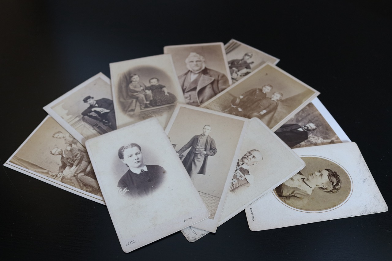
As the title states, following KISS principle we will build an application which helps with populating a family tree.
For those who are not familiar with the acronym, KISS stands for "Keep it simple, stupid!". We might decide for adding more features in the future, but for now it should be as easy and simple as possible.
Related solutions:
Read more:
Details about the project
The problem we are trying to solve is provide a very easy to use application where people can store information about their relatives. Apart from simplicity, privacy is a very important aspect for what we are building.
We will store information about the people in the tree. We will have first name, last name, nick name, gender as minimal information, together with a biography section. The details will include information about the previous name, date of birth, place of birth, date of marriage, place of marriage, date of death, place of death, burial location, occupation, military service, education, residencies.
For relations with other people, we will store parents, spouses, children, siblings. When available, we will store information about the marriage: start date, end date, some details.
In the future, as an important feature, we will want to store photos for each person. Another feature will be to store separately more information about the important events in the life of that person. For each person, wherever possible, we will store some information about the source: who or what the source is (person or document), a note with details and the date when the information was collected. We can also store contact information for the people saved in the
Impementation details
We do not have much complexity inside the application, so we will use React with hooks, with vite as a bundler. For the codebase, we will use the following:
- github actions to publish the application on github pages;
- zod to ensure the data consumed by the app is in a proper format;
- husky to run actions on git events;
- prettier and eslint for clean code;
tailwind for managing CSS;shadcdn/ui as a base for the React components.since the focus was not a custom design, this choice was changed with PicoCSS v2, for quickly creating a nice interface.
More information:
- https://vitejs.dev/guide/
- https://zod.dev/
- https://typicode.github.io/husky/
- https://tailwindcss.com/docs/guides/vite
- https://prettier.io/
- https://eslint.org/
- https://ui.shadcn.com/docs/installation/vite
- https://picocss.com/docs/
- https://www.youtube.com/playlist?list=PL4cUxeGkcC9g0BGP5ATt9tio9R7ky0Ep4
git strategy
Since it's a small project and there will be only one developer, we will use the trunk-based approach.
The main action the project will have is to be published on github pages. Keep in mind that github pages publishes on your username's subdomain, but on a path which corresponds to the repository name. For some libraries (e.g. leaflet), this is important information.
As the project grows, we might go for a different approach.
More info:
Core
In the initial version of the application, there will be no backend interaction. Also, there will be no authentication/authorization logic inside the application.
We will use localStorage to store the information in the browser and provide the option to download the stored information as a JSON file. A visible message about this must be shown in some visible part of the application.
We will use the following convention for the structure:
- -
src/components: Contains the React components, organized by the Atomic Design levels: - -
atomsserve as the fundamental UI components in React, such as buttons, inputs, labels, and icons. They boast high reusability, minimal logic, and accept data through props. For instance, the<Button />atom component straightforwardly renders a `<button>` element; - -
moleculeson the other hand, are basic combinations of atoms designed for a specific purpose. A molecule like a login form could amalgamate `<Input />` and `<Button />` atoms. Molecules may include local state and logic; - -
organismsintegrate molecules to create intricate UI sections. For instance, a header organism might encompass logo, nav, and user menu molecules. Organisms are highly reusable and often are stateful; - -
templatesplay the role of orchestrating UI layouts. They bring together organisms into page sections and may establish designated areas for inserting content. An example is the<DashboardTemplate />, which organizes header, sidebar, and body organisms; - -
Pagesrepresent distinct app screens or routes. They integrate templates, organisms, and other components to form comprehensive views. Components like<HomePage />and<SettingsPage />function at the page level; - -
src/context: Holds React context providers for managing global state (e.g., authentication, themes); - -
src/data: Holds demo/initial data; - -
src/utils: Contains utility functions, such as API calls, validation functions, and other helper functions; - -
src/hooks: Place for the custom hooks our app uses; - -
src/styles: Contains CSS styles for your application; - -
src/types.ts: Global types used in the application; - -
src/constants.ts: Constants used in the application; - -
src/App.tsx: The main application component where you assemble your routing and global context providers; - -
src/main.tsx: The entry point of your application.
src/
|-- components/
| |-- atoms/
| | |-- Button.tsx
| | |-- Input.tsx
| | |-- ...
| |-- molecules/
| | |-- LoginForm.tsx
| | |-- ...
| |-- organisms/
| | |-- Header.tsx
| | |-- ...
| |-- templates/
| | |-- DashboardTemplate.tsx
| | |-- ...
| |-- pages/
| | |-- Home.tsx
| | |-- UserProfile.tsx
| | |-- ...
|-- contexts/
| |-- PersonContext.tsx
| |-- ...
|-- data/
| |-- registry.json
| |-- ...
|-- utils/
| |-- api/
| | |-- api.ts
| |-- helpers/
| | |-- validation.ts
| |-- ...
|-- context/
| |-- AuthContext.tsx
| |-- ThemeContext.tsx
| |-- ...
|-- hooks/
| |-- useLocalStorage.ts
| |-- ...
|-- assets/
| |-- images/
| |-- icons/
| |-- ...
|-- styles/
| |-- global.css
|-- types.ts
|-- constants.ts
|-- App.tsx
|-- main.tsx
|-- ...Code language: PHP (php)
More info:
Screens
The landing page of the application will be a cards view of all the members added. A toggle to show the tree will be visible. A data table could be a nice addition in the future.
We will also show a notification about the storage solution with a link to a page containing more details.
Highlights
One of the main highlights of the project is the ConditionalElement.tsx component. It's purpose is mainly to reduce code cluttering in the template part of the component. In other words, you have less {condition && <ComponentToShow />.
import { ReactNode, ElementType, ComponentPropsWithoutRef, Fragment, createElement } from 'react'

type AsElementType = keyof HTMLElementTagNameMap | ElementType

type ConditionalElementBaseProps<T extends AsElementType> =
  | ({
      condition: boolean
      as: Exclude<T, typeof Fragment>
    } & ComponentPropsWithoutRef<T>)
  | {
      condition: boolean
      as?: typeof Fragment
      children: ReactNode
    }

const ConditionalElement = <T extends AsElementType>({
  as = Fragment,
  condition,
  children,
  ...props
}: ConditionalElementBaseProps<T>) => {
  if (!condition) {
    return null
  }

  return createElement(as, props, children)
}

export default ConditionalElement
Code language: PHP (php)
You will be able to use this for any element, as in:
<ConditionalElement as={Fragment} condition={true}><div /></ConditionalElement>or<ConditionalElement condition={true}><div /></ConditionalElement><ConditionalElement as='p' condition={true}>Hello world!</ConditionalElement><ConditionalElement as={TableWithData} condition={true} />