
I have recently worked on an open source map, which served well to represent points of interest from an external source. While using it, I have come to the conclusion that it can receive some updates.
This is an extension of the existing project, so I will just link the article for prerequisites and any other thoughts:
Do not load default data
While using it, I noticed that the map behaves differently because of the demo data being loaded at first render and then updated with what comes from the provided API endpoint. Therefore, the first change we will do is to create a fallback page for when we don't have an ?api= parameter specified and then tweak the api hook.
In Map.tsx we will add the following code just before the return:
if (!URLParams.api) {
  return (
    <div className="p-4 text-center">
      It appears you have not specified an <strong>?api=</strong> param. You
      can use the default meanwhile:
      <div className="pt-4">
        <a href="?api=/cities_in_romania.json">cities_in_romania.json</a>
      </div>
    </div>
  );
}Code language: JavaScript (javascript)
In the ./hooks/useGetPOI.ts we will do nothing if we don't have a value for the url and return the demo data if its value is provided:
useEffect(() => {
  // No url was provided
  if (!url) {
    return;
  }

  // Load the default data
  if (url === "/cities_in_romania.json") {
    setData(mockData);
    return;
  }

  ...Code language: JavaScript (javascript)
Improve assets structure
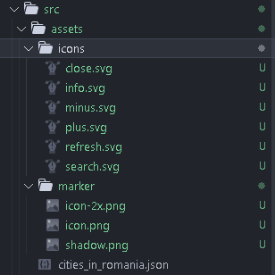
For an improved assets structure, we will move the icons to their own folder and rename the images folder to marker as it only contains the marker images:
Envelope the entries to add metadata
The map currently shows the points of interest, but they are out of context. It would be nice if it had the capacity to show some metadata, whenever the API provides it. We will update the data for that and also create a new component in the project: a button tooltip.
The data structure
We will keep the existing format, but we will also add a case for enveloped data. The approach will be the following:
interface APIEnvelope<T> {
  metadata: string | string[];
  records: {
    latitude: number;
    longitude: number;
    title: string;
    description?: string | string[];
  };
}Code language: PHP (php)
Changing the hook
The envelope we prefer will be {metadata:"", records: []} which means that some changes will also happen in the api hook and the Map.tsx component. One bigger change mainly for code readability is that we will change the data related variable and function names to records:
datawill becomerecords;setData()will becomesetRecords();filteredDatawill becomefilteredRecords.
{
  "metadata": "These are a few of the beautiful cities of Romania!",
  "records": [
    { "title": "Bucharest", "latitude": 44.4268, "longitude": 26.1025 },
    { "title": "Timisoara", "latitude": 45.7489, "longitude": 21.2087 }
  ]
}Code language: JSON / JSON with Comments (json)
The tooltip
To show the metadata when available, we will create tooltip which will be shown on a new info button:
import { FunctionComponent, HTMLProps, PropsWithChildren } from 'react'

interface TooltipProps extends HTMLProps<HTMLButtonElement> {
  text: string | string[]
}

const Tooltip: FunctionComponent<PropsWithChildren<TooltipProps>> = ({
  className,
  children,
  text,
}) => {
  return (
    <div className="group relative inline-block duration-300">
      {children}
      <div
        className={`tooltip absolute -right-3 -top-2 hidden translate-x-full cursor-pointer rounded-md bg-gray-800 px-2 py-1 text-sm text-white opacity-90 before:absolute before:right-[100%] before:top-1/2 before:-translate-y-1/2  before:border-8 before:border-y-transparent before:border-l-transparent before:border-r-gray-800 before:content-[''] group-hover:block ${className}`}
      >
        {!Array.isArray(text)
          ? text
          : text.map((textItem, key) => (
              <div className="mb-2" key={key}>
                {textItem}
              </div>
            ))}
      </div>
    </div>
  )
}

export default TooltipCode language: JavaScript (javascript)
More info:
The new button
In Map.tsx, below the last button wrapper we will add:
{!!metadata && (
  <ButtonWrapper className="absolute left-[10px] top-[120px]">
    <Tooltip text={metadata} className="text-left w-[240px] ">
      <MapButton>
        <IconInfoSVG width={15} height={15} />
      </MapButton>
    </Tooltip>
  </ButtonWrapper>
)}Code language: HTML, XML (xml)
Now, when hovering over the information button, we should see a tooltip opening to the right. 😸
Prettier to handle the order of tailwind classes
We will use prettier to auto arrange the tailwind classes in a predefined order in Visual Studio Code. I think this is a step that needs to be done in most of the projects using tailwind.
We already have eslint in the project, so we will only do some tweaks there.
npm install --save-dev eslint prettier @typescript-eslint/eslint-plugin @typescript-eslint/parser eslint-config-prettier eslint-plugin-import eslint-plugin-jsx-a11y eslint-plugin-react eslint-plugin-react-hooksnpm i --save-dev prettier-plugin-tailwindcss
.eslintrc.cjs will be updated to:
module.exports = {
  root: true,
  env: { browser: true, es2020: true },
  extends: [
    "eslint:recommended",
    "plugin:react/recommended",
    "plugin:react-hooks/recommended",
    "plugin:import/recommended",
    "plugin:jsx-a11y/recommended",
    "plugin:@typescript-eslint/recommended",
    "eslint-config-prettier"
  ],
  settings: {
    "react": {
      "version": "detect"
    },
    "import/resolver": {
      "node": {
        "paths": [
          "src"
        ],
        "extensions": [
          ".js",
          ".jsx",
          ".ts",
          ".tsx"
        ]
      }
    }
  },
  rules: {
    "no-unused-vars": [
      "error",
      {
        "vars": "all",
        "args": "after-used",
        "ignoreRestSiblings": true,
        "argsIgnorePattern": "^_"
      }
    ],
    "react/react-in-jsx-scope": "off",
    'react-refresh/only-export-components': [
      'warn',
      { allowConstantExport: true },
    ],
    "jsx-a11y/no-static-element-interactions": "off",
    "jsx-a11y/click-events-have-key-events": "off"
  },
  ignorePatterns: ['dist', '.eslintrc.cjs'],
  parser: '@typescript-eslint/parser',
  plugins: ['react-refresh']
}
Code language: JavaScript (javascript)
.prettierrc will become:
{
  "trailingComma": "all",
  "tabWidth": 2,
  "semi": false,
  "singleQuote": true,
  "printWidth": 80,
  "bracketSpacing": true,
  "endOfLine": "lf",
  "plugins": ["prettier-plugin-tailwindcss"]
}Code language: JSON / JSON with Comments (json)
More info:
- https://dev.to/marcosdiasdev/adding-eslint-and-prettier-to-a-vitejs-react-project-2kkj
- https://tailwindcss.com/blog/automatic-class-sorting-with-prettier
Zod for safe API responses
Typescript will help us while developing the applications. But once we build, we will lose the advantages of type safety and fallback to plain old javascript. This will lead to the unpleasant situation were we will have nasty errors in the application when the API response does not match what we expect.
For such cases, we can use zod to ensure that what we receive is what we want.
npm i zod
The first step is to define our zod entities:
import z from 'zod'

export const customMarkerSchema: z.ZodType<CustomMarker> = z.object({
  latitude: z.number(),
  longitude: z.number(),
  title: z.string(),
  description: z.union([z.string(), z.string().array()]).optional(),
})

export const metadataSchema: z.ZodType<Metadata> = z.union([
  z.string(),
  z.string().array(),
])

export const customMarkerWithMetadataSchema: z.ZodType<CustomMarkerWithMetadata> =
  z.object({
    metadata: metadataSchema,
    records: customMarkerSchema.array(),
  })Code language: JavaScript (javascript)
We could use z.infer() to remove the part where we define our types, since we already define a type in the zod schemas.
e.g. type CustomMarker = z.infer<typeof customMarkerSchema>
However, after we do that we will need to export and import types, instead of simply having them simply available from the bundler. We might do this change in the near future.
The second step will be to use zod to actually check the response format:
const validatedResponse =
  customMarkerWithMetadataSchema.safeParse(json)

if (!validatedResponse.success) {
  throw new Error('Could not parse the entities in the response.')
}

setRecords(validatedResponse.data.records)
setMetadata(validatedResponse.data.metadata)Code language: JavaScript (javascript)
More information:
- https://zod.dev/
- https://stackoverflow.com/questions/74068609/zod-show-inferred-nested-types-in-ide
- https://youtu.be/AeQ3f4zmSMs
Refactoring
It doesn't feel like the project needs more features at the moment. However, since watching your own code after a few months is kind of like doing a harsh code review :)) , some improvements need to be made.
Filter in the useGetPOIs hook
The first and most important is to move the filtering directly into the hook which fetches the records. This will reduce much of the complexity in the map an also make the whole approach more readable.
...
const useGetPOIs = (url?: string, search?: string) => {
...
  return {
    records: !search
      ? records
      : records.filter((record) => {
          const allText = `${record.title} ${
            Array.isArray(record.description)
              ? record.description.concat(' ')
              : record.description
          }`
          return allText.toLowerCase().includes(search.toLowerCase())
        }),
    metadata,
    loading,
    error,
    reload: () => {
      setReload(reload + 1)
    },
  }
}

export default useGetPOIs
Code language: JavaScript (javascript)
Create useMap custom hook for the map logic
By creating a custom hook with the logic of the map used in Map.tsx, we will declutter the main component even further:
import { useState, useMemo, useCallback, useEffect } from 'react'
import L, { LatLngExpression, Map as MapType } from 'leaflet'

const useMap = (records: CustomMarker[], bounds_padding: number) => {
  const [map, setMap] = useState<MapType | null>(null)
  const [isZoomInDisabled, setIsZoomInDisabled] = useState(false)
  const [isZoomOutDisabled, setIsZoomOutDisabled] = useState(false)

  const bounds = useMemo(
    () =>
      L.latLngBounds(
        records.map<LatLngExpression>((poi) => [poi.latitude, poi.longitude]),
      ),
    [records],
  )

  const setMapBounds = useCallback(() => {
    if (!map) {
      return
    }

    map.fitBounds(bounds.pad(bounds_padding))
    map.setMaxBounds(bounds.pad(bounds_padding))
  }, [map, bounds, bounds_padding])

  useEffect(() => {
    if (!map || !bounds.isValid()) {
      return
    }

    const setBoundsTimeout = setTimeout(() => setMapBounds(), 1000)

    return () => clearTimeout(setBoundsTimeout)
  }, [map, bounds, setMapBounds])

  useEffect(() => {
    if (!map) {
      return
    }

    map.on('zoom', () => {
      const zoom = map.getZoom()
      const maxZoom = map.getMaxZoom()

      setIsZoomOutDisabled(zoom === 0)
      setIsZoomInDisabled(zoom === maxZoom)
    })
  }, [map])

  return { map, setMap, setMapBounds, isZoomInDisabled, isZoomOutDisabled }
}

export default useMap
Code language: JavaScript (javascript)
Implement a conditional element
Recently I have read a very nice article about how to improve the code readability in your react application. What we will basically do is create a wrapper component for anything that is rendered based on a condition, and then use that instead.
Our component will be:
import React, { ComponentProps } from 'react'

type ConditionalElementBaseProps<T extends keyof HTMLElementTagNameMap> = {
  as?: T
  rcIf?: boolean
}

type ConditionalElementProps<T extends keyof HTMLElementTagNameMap> =
  ConditionalElementBaseProps<T> & ComponentProps<T>

const ConditionalElement = <T extends keyof HTMLElementTagNameMap>({
  as,
  children,
  rcIf = true,
  ...props
}: ConditionalElementProps<T>) => {
  if (rcIf === false) {
    return null
  }

  if (as) {
    return React.createElement(as, props as ComponentProps<T>, children)
  }

  return <>{children}</>
}

export default ConditionalElement
Code language: PHP (php)
Read more: